Contents

Contents

Contents

  1. Overview

  2. Problem statement

  3. User research (persona, empathy mapping, user journey, survey)

  4. Ideation (Crazy8s)

  5. Designs

  6. User testing

  7. Reflections

What is it?

What is it?

What is it?

A food management app that helps with:

  1. Inventory management

  2. Hyperlocal food give away

  3. Waste analysis

  4. Recipes

I reached out to Kasper, founder NoWaste, a competitor app (10k+ downloads on Play Store) and this is what he had to say:

Role

Role

Role

We were a team of 5. I specifically worked on the 'Pantry,' 'Community,' and 'Onboarding' sections. All the screens in this case study were designed by me.

Note

Note

Note

This project was done under the supervision of A. Fleming Seay, Director of User Experience Research & Design at Dell Technologies.

Timeline

Timeline

Timeline

Sep 2024 - Nov 2024

Problem

Problem

Problem

Food wastage is a major issue both in the United States and globally. households contribute significantly to the problem by:

  1. Purchasing more than needed

  2. Failing to consume food before it expires, leading to unnecessary waste, etc.


Addressing this requires not just tools for inventory management but also behavioral shifts toward mindful consumption.


So, how might we come up with a solution to help households track their food inventory effectively, purchase appropriate amounts, and develop sustainable habits that minimize waste at the consumer level.

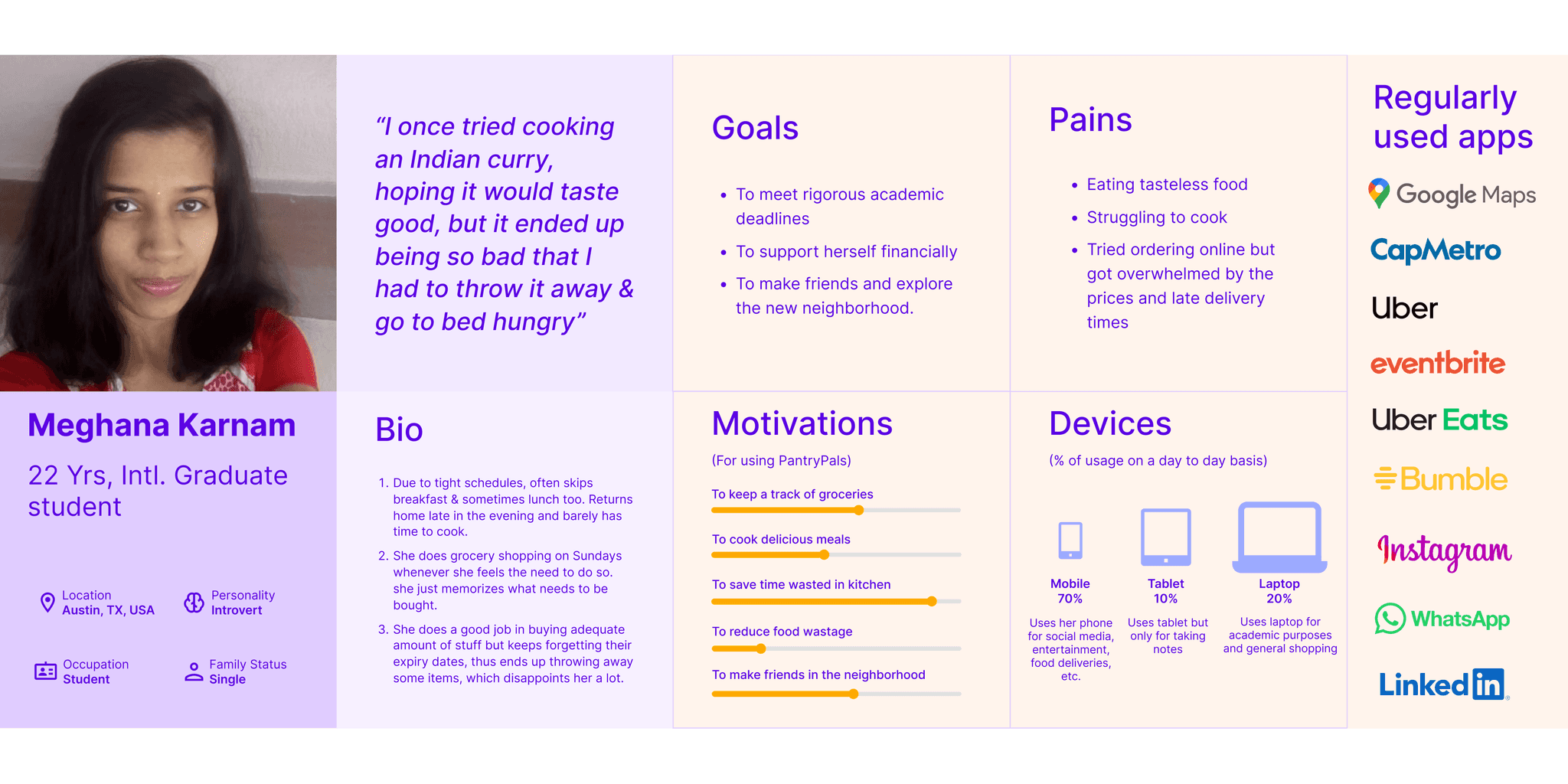
Here's a user persona of a potential user with valuable insights. For example, their favorite apps reveal aesthetic preferences and guide us on where to market our app, etc.

Now that we understand the different circumstances faced by users, it's important to see things from their perspective:

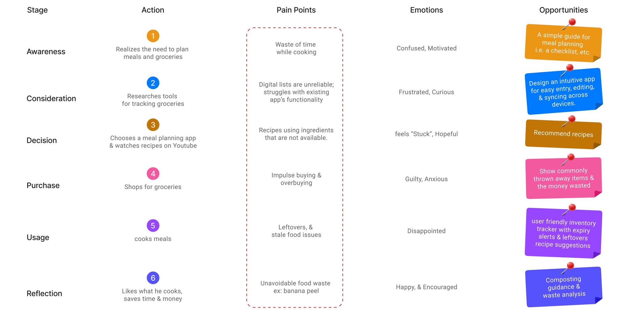
Based on the user persona & the empathy map, I drew the user journey as follows:

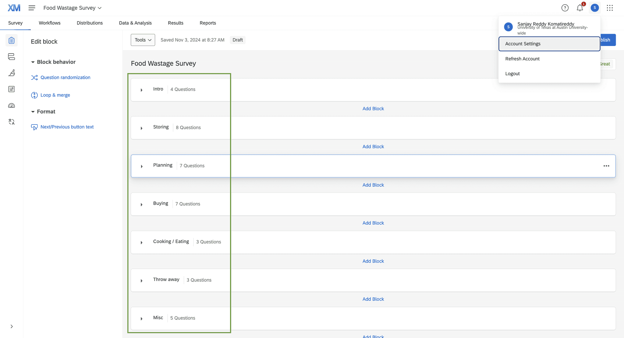
I prepared a mixed-methods survey of 37 questions with if else logic for user research using qualtrics.com & we had 32 survey takers overall.

We used Crazy8s to ideate. Here are a few of my ideas:

Later, we card sorted all our ideas into the four quadrants.

Ideas in the first quadrant are both helpful (UX) and cool (UI) But we had too many ideas in the 1st quad., so, we only considered the cream.

Each of us quickly tried a few ideas, presented them to each other, and eventually settled on 'PantryPals.'

I always start with pen and paper; it helps me try out my ideas faster and iterate quickly.

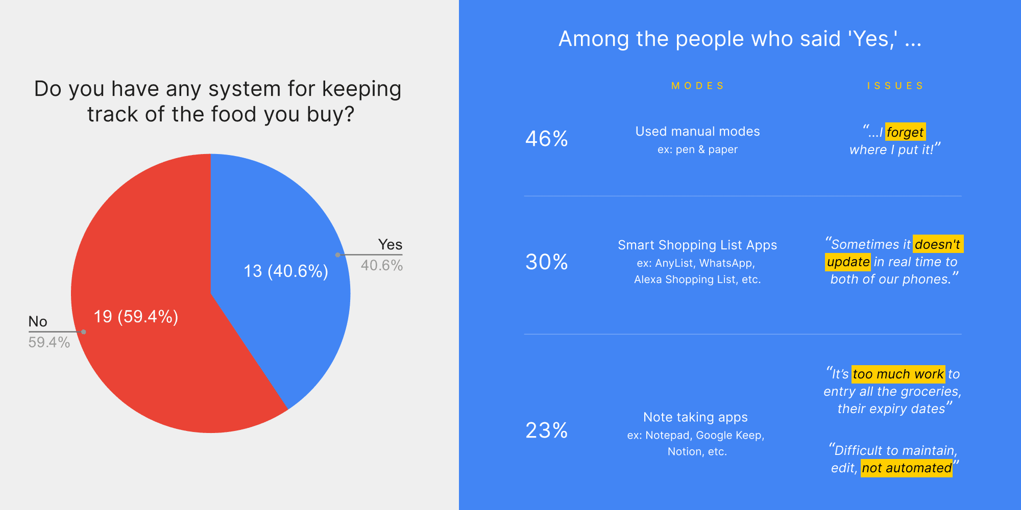
It is clear that the majority of people do not have an existing system to track groceries. Even those who said 'Yes' are facing issues with their current systems.


This presents an opportunity to create a better inventory management solution:

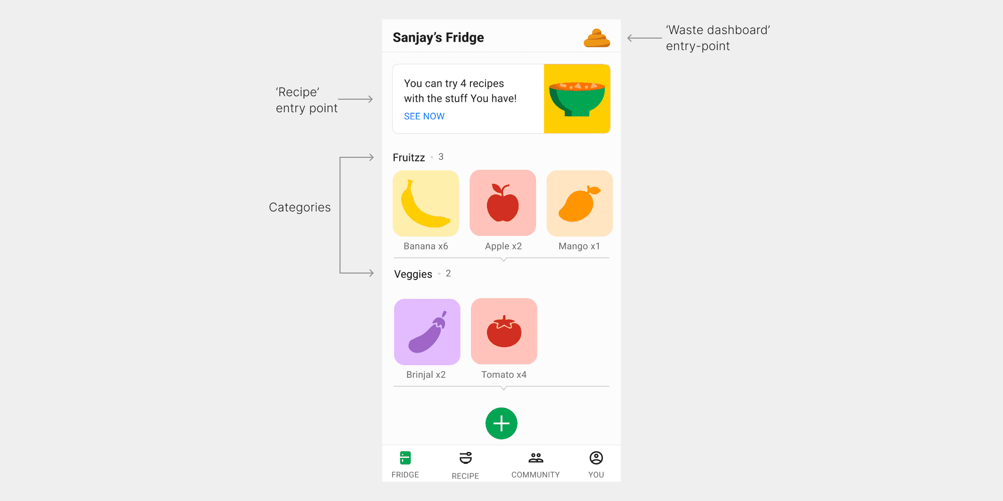
'Fridge' tab acts as an inventory management portal that is digital, on-the-go, & well organized.


Each category is a row and multiple such rows are stacked. This allows the user to scroll and explore different categories at once.


The big round green CTA at the bottom near your fingers allows you to load food items into the Pantry.

Since the majority said 'Yes,'

Since the majority said 'Yes,'

Since the majority said 'Yes,'

We proceeded to ask the following:

  1. What methods do they use to track quality and expiry?

  2. On a scale of 1 to 10, how successful are their current methods?

Then,

Then,

Then,

I color coded the methods into:

  1. Systematic

  2. Manual

  3. Memory


Clearly, systematic approaches won. Here are a few insights:


  1. "Rotation method. Newer items behind old items."

  2. "I organize my shelves and date order"

  3. "Organize by expiry date"

Overbuying is another problem that I observed:

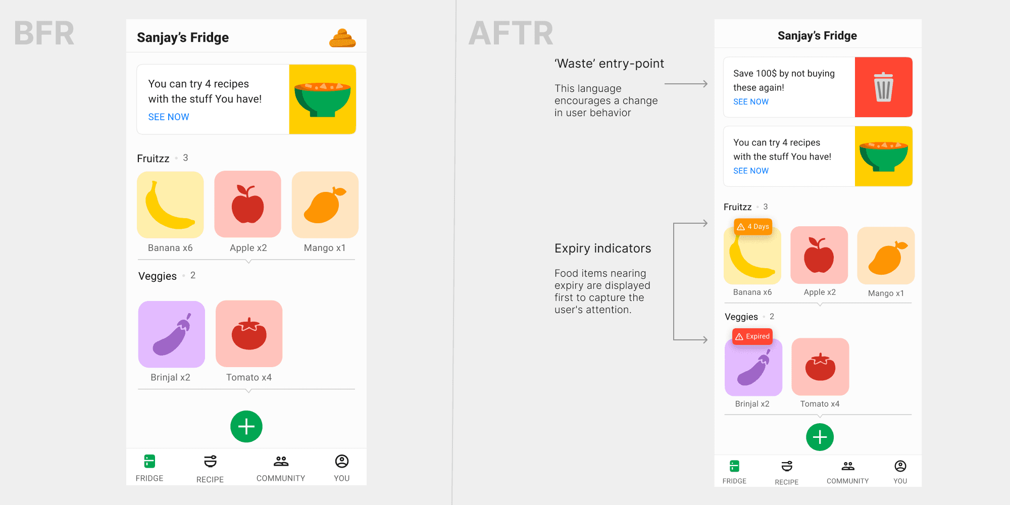
Based on the above insights, I made a few changes to 'Fridge' to:

  1. Make the 'Waste' analysis more visible to curb overbuying.

  2. Implement rotation method to keep users updated on quality/expiry.

We asked our users, What do you do with expired food?

In a few cases food waste is unavoidable i.e. banana peels, apple cores, avocado pits, eggshells, etc. The above findings tell us that there's no awareness about composting. 'Waste' analysis could be a great place to educate users about it.

KitchenPal, our competitor, follows a rigid format for inventory i.e. Fridge, Freezer, & Cellar. In contrast, we adopted a more intuitive and logical approach.

Categories

Categories

Categories

I initially planned to let users scan their fridge to generate a 3D simulation and log food items.

However, we realized that different fridge orientations made this approach unscalable.

Instead, we categorized food items into 12 broad categories.

Interaction

Interaction

Interaction

Users can update a food item's status by dragging and dropping it (followed by haptic feedback) into:

  1. Lend: Giving away the item to the community

  2. Ate it: Consumed the item

  3. Trash it: Discarded the item


Upon user testing the drag and drop interaction had mixed reviews. So I dropped it.

Speaking of user testing, here is a summary:

After round 1,

  1. I changed the 'drag and drop' to a simple 'tap' interaction (which is also more accessible)

  2. Renamed 'Fridge' to 'Pantry' based on user feedback, as groceries are stored in various places, not just the refrigerator i.e. cupboards, dishwasher, etc.

  3. Some users were confused by 'Lend,' so I considered alternatives like 'Share,' 'Give away,' and 'Donate,' settling on 'Give away.'

Adding items

Adding items

Adding items

We've seen how to manage existing inventory. Now, let's see how to add new items.

Upon user testing we received a It’s convenient and quick to do

but most of the feedback was negative:

NoWaste, a competitor app, enables inventory entry via a barcode scanner.

Users must scan each item, and

  1. most barcodes don't include the expiry date, it requires manual entry.

  2. The product name encoded in the barcode is often in shorthand.

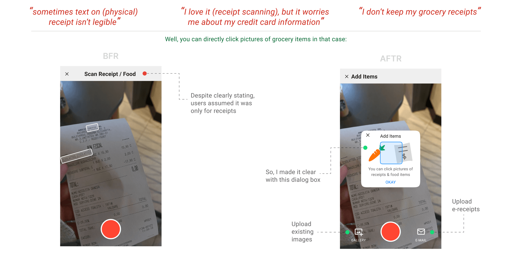
In contrast, taking a top-angle picture of all the grocery items is much easier.

Based on user feedback, I’ve added an image roll feature since you might not be able to capture all the grocery items in a single frame.

After scanning, you can review the entered items and make any necessary corrections:

For the above screen, users' responses were as follows:

  1. “It is amazing, I like that it has the expiry date already logged”

  2. “how are the expiry dates pre determined?”

    For fruits & vegetables, the app uses existing knowledge & calculates expiry date automatically based on when they are entered into the Pantry.

    for ex: say you enter apples today, as per general knowledge we know that apples stays fresh for as long as 6 weeks, so the app automatically does the math.

During user testing, users raised a few interesting doubts:

  1. "What if certain items are printed in short forms (on receipts)?"
    The app already has a dataset of common grocery items. If it can match the short form to the closest item, it should work seamlessly.

  2. "When I shop, I often grab a few non-grocery items too…"
    That shouldn't be a problem since receipts usually have codes that indicate food (F, FW, etc.) and non-food items (T).

Community
In user survey, we asked:

What strategies did you use (to reduce food waste), and did they work?

  • “...and I often share foods with coworkers, neighbors, etc.”

  • “...If I have a lot of leftover food, I also invite friends over to share it.”

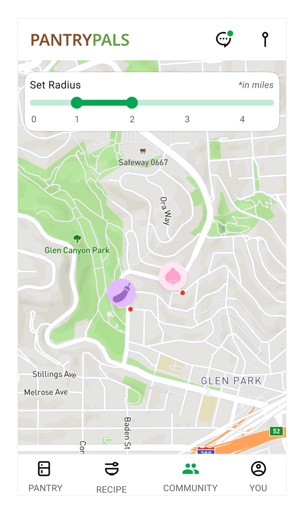
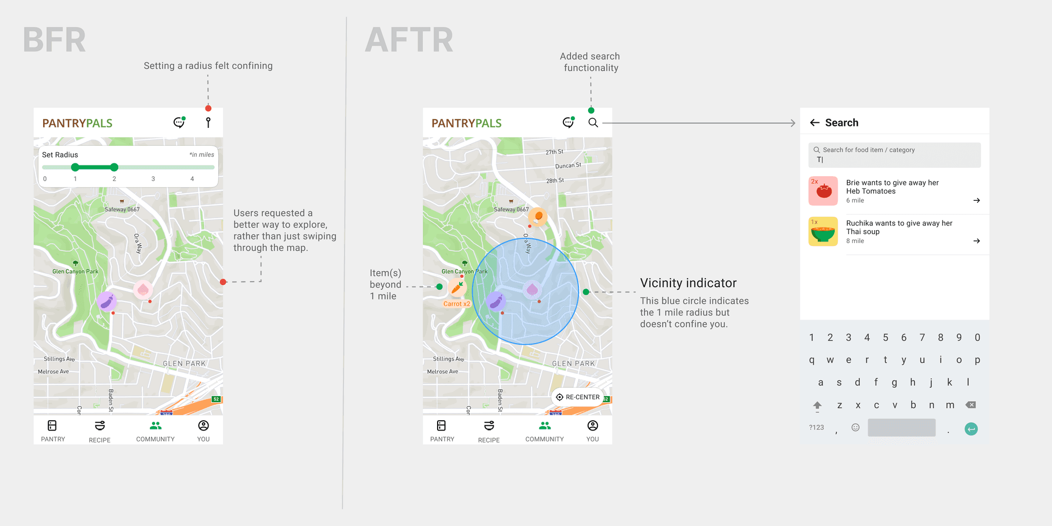
Thus, I came up with the idea of 'Community,' it lets you give away your food to neighbors, for free of course.

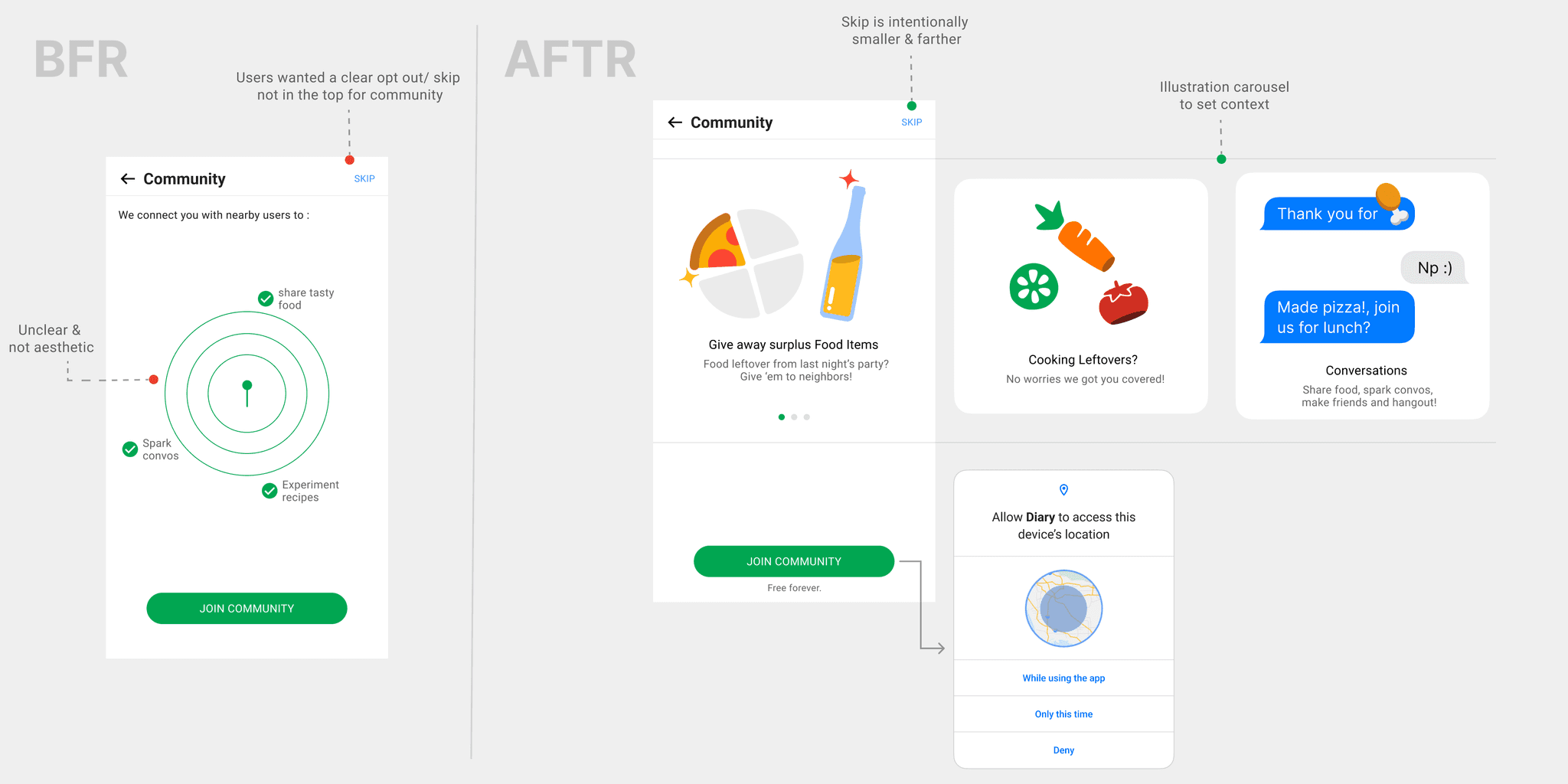
Since, 'Community' is a new feature, I wanted to familiarize users during onboarding:

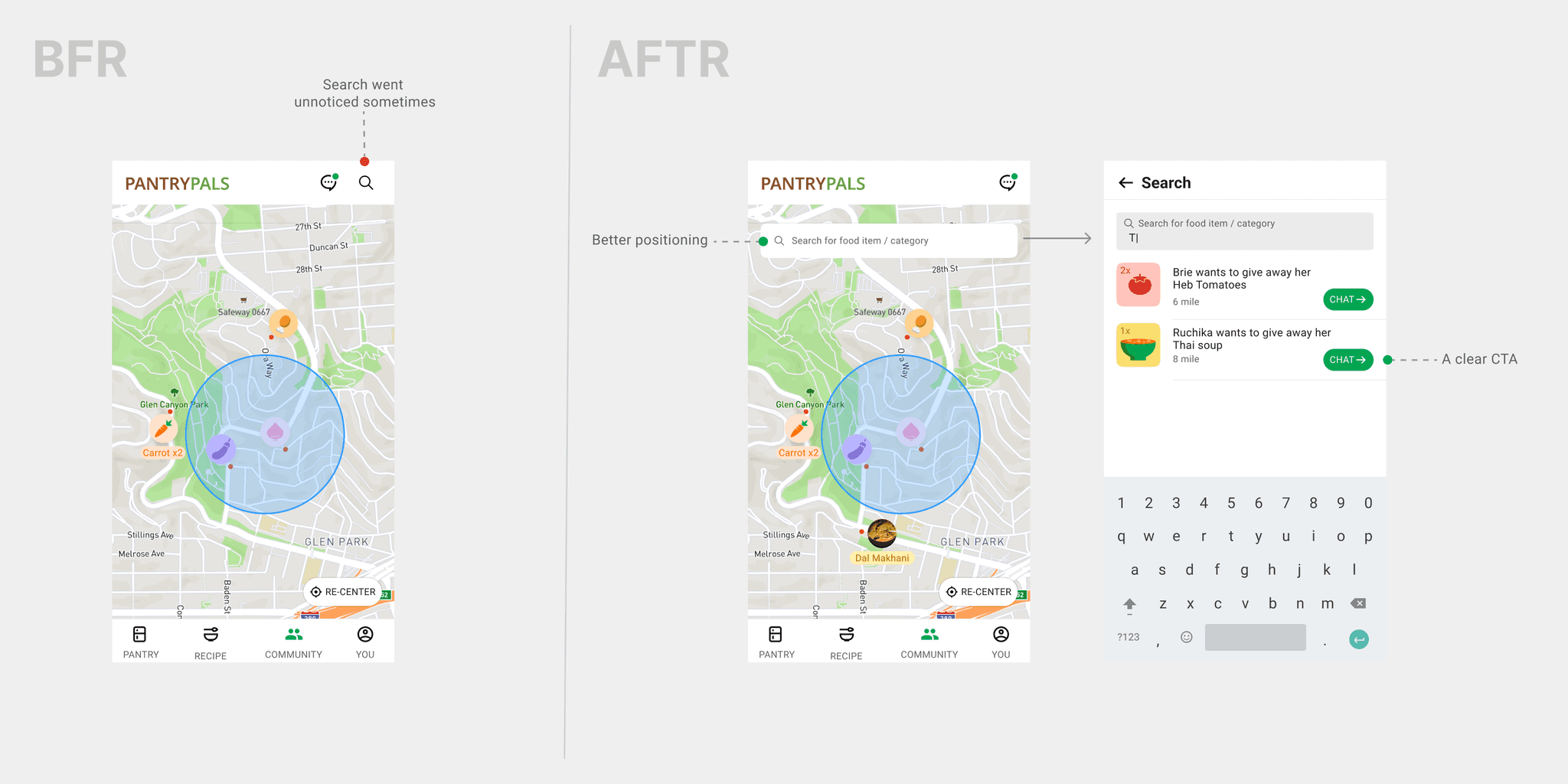
Upon further user testing, we realized:

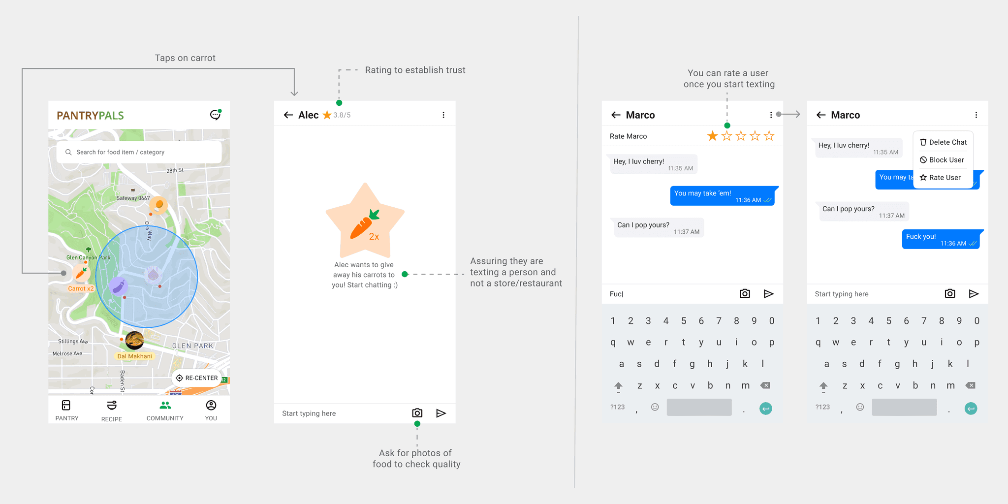
We continued iterating…

At this point, users liked the idea of Community, but they

  1. were cautious about the hygiene & trust issues

  2. were unclear if locations were houses or stores

Recipes

Recipes

Recipes

As the name suggests, this screen has recipes. Let's look 2 scenarios:

Decision fatigue

Isn't it funny how we spend more time deciding what to eat than actually eating it!
(Hick's law)

Lack of ingredients

You’re watching a recipe video, all excited, then halfway through, the cook pulls out ingredients you’ve never even heard of.

We didn’t want our users dealing with these problems. So, what did I do?

I recommended recipes based on the ingredients you already have (prioritizing ones about to expire) and the time taken to cook.

We found another insight through surveys:

Overall, feedback from potential users showed a strong desire to use the design as a fully functioning app.

Reflections:

  1. Upon further reflection, I now feel that 'Kitchen' would be a more fitting name for what was previously called 'Pantry,' instead of 'Fridge.'

  2. Figma is not the best tool for prototyping (realized while implementing the drag and drop interaction.)

  3. Usertesting.com is faster in sourcing qualified participants compared to manual testing. However usertesting.com demands a decent prototype to avoid prototyping traps.

  4. Working in a team expands your perspective.

  5. In the future, I plan to add a shopping list feature based on the items in the pantry.

Well, that’s a wrap! Here are a few more projects that I worked on:

Brekrr

Live

LandManager

Client project (POC)

© 2024 Sanjay Reddy Komatireddy