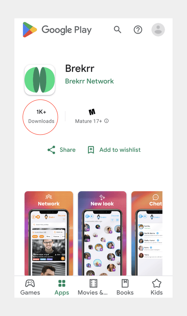
Currently live on app store and play store with over 1000 active users in its beta stage, Brekrr is a dating & networking app.
Solo designer but collaborated actively with the development and the marketing teams (reference.)

The founders pivoted the idea in the last moment. Yet, I acted quickly with rapid prototyping & delivered.
Designed for android, iOS & web (landing page)

Rudraksha Reddy
CBO Brekrr
"The designs were able to project our target user's persona. Good to use. Easy colourful interface. Gets the job done!"
Oh! I forgot to tell you that Brekrr recently raised angel investment!

Context
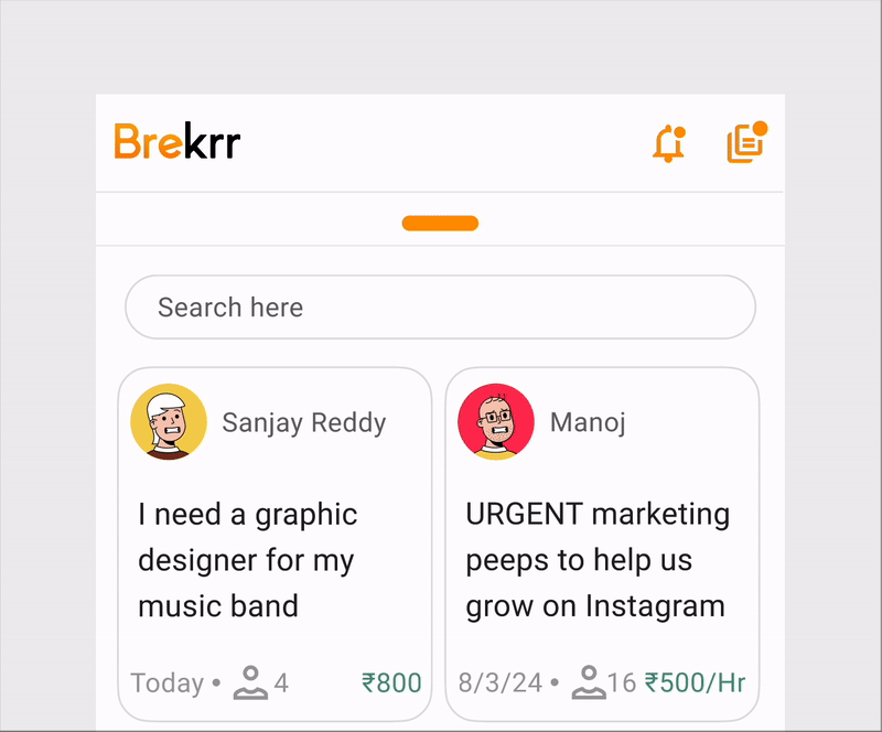
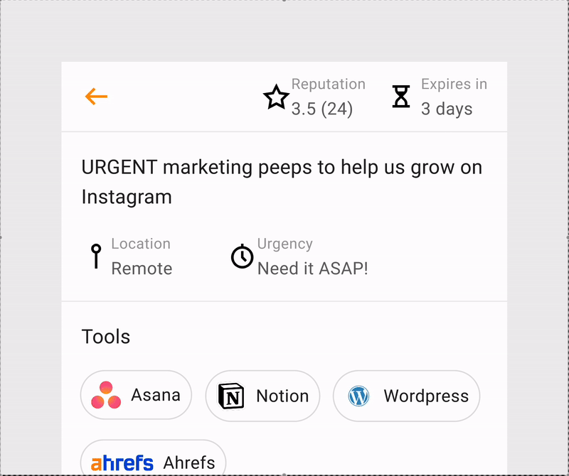
There are 2 networking features
'Tasks'
which refers to hyperlocal gigs
'Work'
jobs & internships
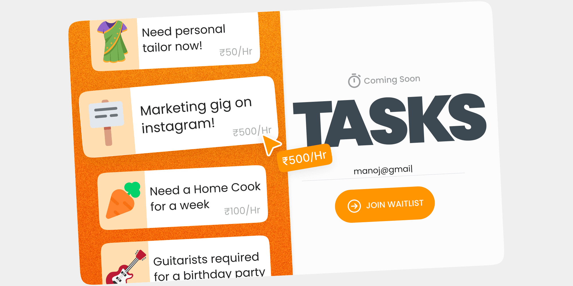

Existing apps such as LinkedIn, Internshala, etc., help you find 'Work' i.e. jobs and internships.
What about teens who don't necessarily need a job but are good at something and want to make a quick buck?
Gigs is the answer!


For the start-up and incubator profiles, I've designed these default cover photos to be handy.
The client was very specific about displaying the filters on the screen, while I suggested hiding them inside a filter icon to save screen real estate.
So, I implemented this instead: as you scroll down, the filters disappear, and when you scroll up, they reappear, as that's when you typically need them.
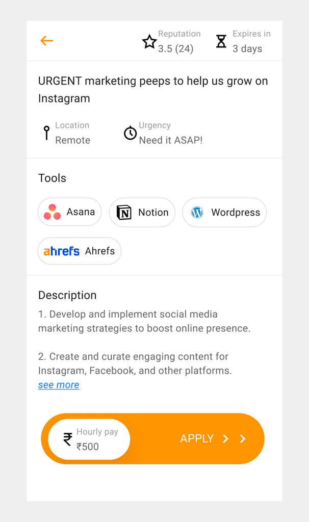
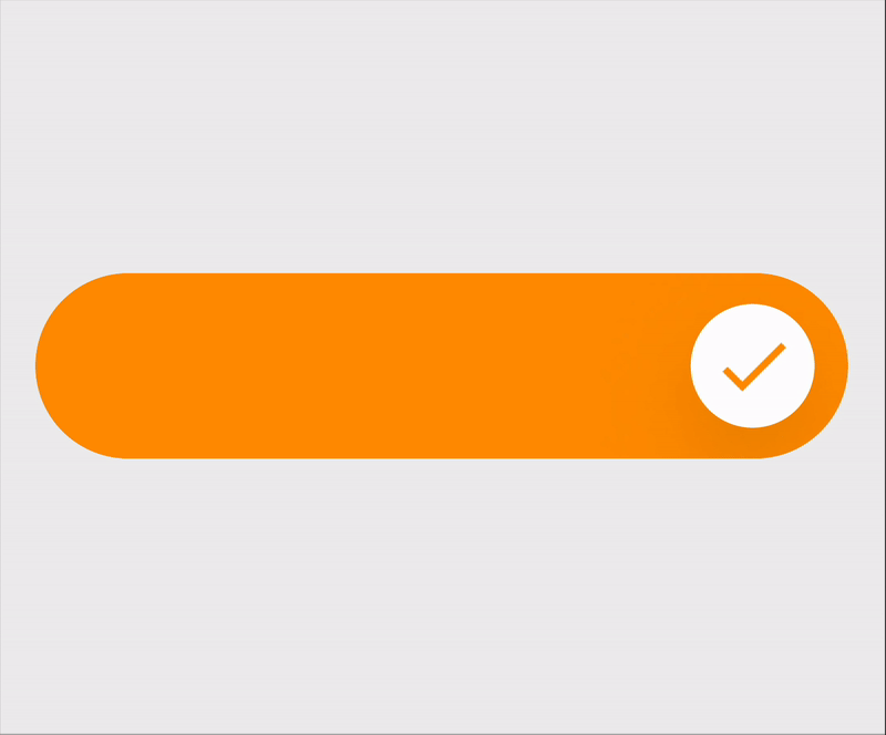
This is the screen to apply to a gig. Let's focus more on the
CTA at the bottom.
Displaying the salary on the CTA makes it more enticing
If it's a tap it's just a tap. Instead I wanted the user to consciously slide across the screen looking at the salary getting checked, giving haptic feedback and a small sense of achievement to push them to keep applying.
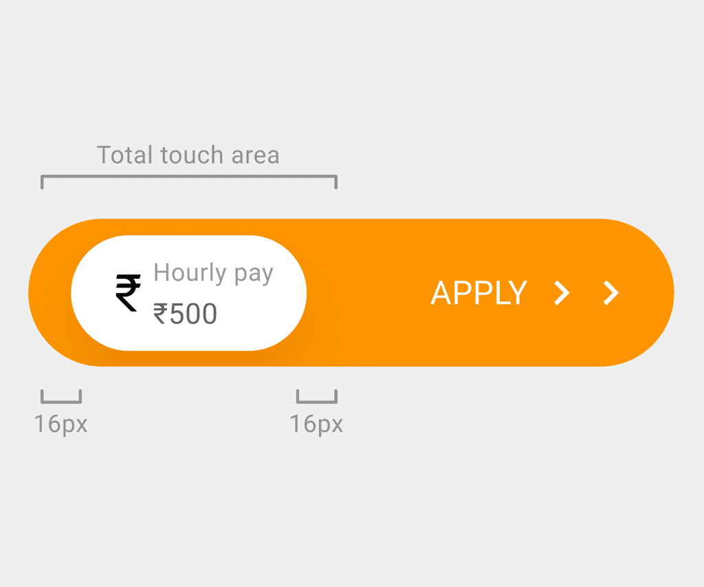
I didn't want the salary to be covered by the user's thumb, thus the touch area is increased by 16px (subject to testing) on both the sides.
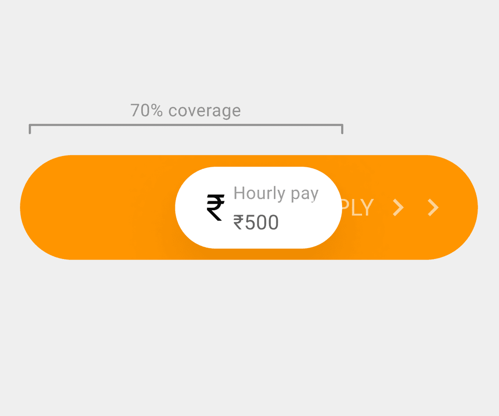
You try to unlock your iPhone by sliding but it misses every single time or your fingers are wet & you are unable to take the call.
Well, in our case no need of sliding it all the way across, even if it covers 70%, it automatically accepts.

The business objectives require the users to apply to as many opportunities as possible. Once the user applies, an undo CTA slides in.
However, there was a concern that users might tap on it by mistake, as it was too close to their fingers.
Yes, it disappears in 5s. But it's like taking away the control from the users and it's not recommended.
In a few cases, the countdown might trick users who are on the fence into withdrawing the application too.
I tried introducing it as a kebab menu (hidden inside it).
Although, it's one click deep and farther, introducing a new UI element causes distraction & the user is more likely to withdraw an application if he/she wants to.

Once the application is submitted, there will be no change in the UI.
The user can simply slide it back to withdraw the application.
Thus, the flow for withdrawing the application is intuitive, yet not entirely straightforward.
Takeaway
Clearly communicating your ideas with the developers helps you stay aware of technical constrains.
Design components make your life easier and efficient.